Showing posts with label cover art. Show all posts

Monday, July 15, 2013

Facebook and Google+: Sizing It Up!

I don't expect the good folks at Facebook and Google+ to start communicating, let alone coordinating ANYTHING, anytime soon.

They are responsible for every hair on my head that I've pulled out lately, namely for their ability to create “double work” when it comes to artwork for a personal profile, pages, or events.

So many sizes! Google+ sizes are longer than Facebook’s and not quite as tall.

Here’s an example from one of the shows on Groovy Reflections Radio. I created the Facebook event art first (714 X 264): 


Then I just elongated the artwork by adding some yellow on either side and sliced the bottom off a bit (this took me all of 5 minutes). Not the best solution but it works in a pinch (1200 X 300):


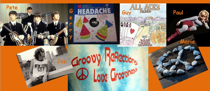
And here’s an example where I spent a bit more time trying to make it all fit, first Facebook (again, this is event art):


And here is the Google+ version. I find it a challenge to have less height to work with and had to slice some heads (poor Marcia Marcia)! The area for copy was a bit leaner too:

Could never remember the sizes I needed to work with I found myself looking up on the internet the correct sizes over and over. Finally wised up and created this handy little chart:


Feel free to print it the chart above and stick it on your refrigerator (just kidding). How ‘bout your bulletin board or maybe tape it to your desk instead?

Hope you find it helpful. I've found myself creating more and more cover arts and event art pieces so having this handy is a big help! It would be even better of course if Facebook and Google+ could choose some universal sizes. Ha! Not going to happen anytime soon (if ever).

Ah, yes, shapes of things. The Yardbirds sang about them back in the 60's (see below). Luckily, we're only dealing with rectangles here! If your social media efforts are too square, contact us via our websiteor say hello on TwitterFacebook, or Google+ 


Friday, March 16, 2012

Oh, That Facebook Cover Art!

Current cover art for my personal profile, taken 2/23 
Gotta admit, I was rather frazzled when I switched to Facebook's Timeline for my personal profile. To keep things simple, I took a large photo of a sunset and slapped it  up on the top of the page. So what if it didn't fit; I wriggled it around a little and it was pretty decent.


But it's a different game entirely with pages. Why? Because one photo just won't cut it in order to properly represent what the page is all about. I'll use Groovy Reflections, one of my pages, as an example. 


Since there are six team members, I felt it should be a group effort with one photo from each of them representing what Groovy Reflections is all about. The brand logo would also be part of it, bringing the number of photos to seven. Furthermore, I wanted to add all our names to the artwork, since we are so behind the scenes. It's an opportunity to get our names out there to the fans; not enough fans make their way over to the website, where they'd find bios for each team member.

First cover for Groovy Reflections

And how I struggled with getting that artwork to fit, just like I struggled with the multi-photo cover for this Facebook page. A quick search would have revealed several sources stating that the dimensions should be 850 wide by 315 in height. That's pixels we're talking about!

Upon discovering the official dimensions, the task just became easier! 

And, here's a few more guidelines about cover art:
  • No selling! Don't tell us about the latest deals here.
  • It's meant to be visual so have fun with it. 
  • Should be representative of your product or service.
  • No pleas to people to let others know about your page.
  • Don't include anything about asking them to share or like the page. 
  • No URLs, emails or any info that leads them to another way to contact you.
If you're creating your own cover art and don't use Photoshop or another graphic software, try using PowerPoint. Later versions have plenty of tools for creating visual splendor. As a rough measure, the art should be about half of the size of a slide (see pic below). 


Approx size of cover art when using PowerPoint
If you're a veteran at putting together a slide show for all those important presentations, this is not all that difficult to do. 

You may want to change your Facebook cover art often, maybe every two weeks or every month so that the fans get into the habit of stopping by to see what's new. This is easy if you are a product-oriented company, since you can highlight various products, however, with a service, you may want to:
  • Use seasonal photos
  • Photos of things that hold interest for you but help define the brand and who you are
  • Include your logo
  • Have a photo of you or your team included
  • Include a photo of your office or the building
  • If you're a local business, photos of places around town

The possibilities are endless! Be creative, remember that the size is 830 X 315, and use a rainbow of color! Enjoy this tune by the Rolling Stones: Click here